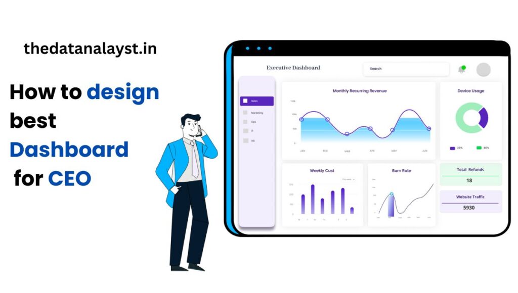
In today’s fast-paced business environment, CEOs must make critical decisions swiftly and with confidence. A well-designed dashboard can offer the high-level insights they need, allowing them to monitor business performance, identify emerging trends, and make data-driven decisions that drive growth. This guide will walk you through the essential steps to create a dashboard that caters to a CEO’s unique needs, from selecting key metrics to designing a visually compelling interface.

How to Create a Dashboard for CEO
If you have to design a new dashboard for your CEO or modify existing one there are so many factors to be taken in consideration.
You need to understand the perspective of your CEO , understanding CEO’s expectations , needs and goals. You have to get clarification about KPI are needed .
You have to get clarification about what data source to use and what tool to use , let us get started with it and understand these concepts in depth .
Understanding Your CEO’s Perspective
Before diving into the technical aspects, it’s vital to understand your CEO’s specific goals, concerns, and expectations. Tailoring the dashboard to align with these priorities ensures that it delivers the most relevant information. Consider asking the following questions:
- What are the CEO’s primary concerns and business goals?
- Which key performance indicators (KPIs) are most important to track?
- How often does the CEO need to review the dashboard?
- What level of detail is preferred—high-level metrics or in-depth analysis?
By focusing on these questions, you can create a dashboard that addresses your CEO’s decision-making needs.
Identifying Key Performance Indicators (KPIs)
The backbone of a successful CEO dashboard is selecting KPIs that align with the organization’s strategic objectives. Here are some essential categories of KPIs to consider:
- Financial Performance: Revenue, profit margins, cost reduction, and ROI.
- Customer Satisfaction: Customer acquisition, retention rates, Net Promoter Score (NPS), and satisfaction surveys.
- Operational Efficiency: Production rates, resource utilization, and turnaround times.
- Market Share: Market penetration, competitor comparisons, and customer share.
- Employee Engagement: Employee satisfaction scores, turnover rates, and productivity metrics.

Common KPIs for CEO Dashboards
| KPI | Description |
|---|---|
| Revenue Growth | Measures the percentage increase in company revenue over a period. |
| Operating Costs | Tracks the total costs of running the company to improve efficiency. |
| Customer Churn Rate | Indicates how many customers are lost over time. |
| Employee Turnover | Tracks the rate at which employees leave the organization. |
| Net Profit Margin | A measure of profitability that shows how much profit a company makes after all expenses. |
Data Sources and Integration
To populate your dashboard, it’s important to identify reliable data sources. Integrating multiple systems can provide a comprehensive view of the business. Here are common data sources to consider:
- Enterprise Resource Planning (ERP) systems: These track financials, procurement, and project management.
- Customer Relationship Management (CRM) systems: Track customer interactions and sales data.
- Business Intelligence (BI) tools: Analyze data and generate reports.
- Data warehouses: Store vast amounts of structured and unstructured data.
- Third-party data providers: Supply market and industry benchmarking data.
Data Integration
Seamless data integration is key to a unified dashboard. Using platforms like Microsoft Power BI, Tableau, or custom APIs can help in pulling data from disparate systems into a single, centralized interface.
Dashboard Design Principles
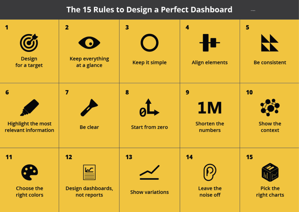
A great dashboard isn’t just about data—it’s about clarity, usability, and aesthetics. Adhering to these design principles will ensure that your dashboard is intuitive and actionable:
- Simplicity: Keep the interface uncluttered, focusing only on the most critical metrics.
- Clarity: Use concise labels and make data visualizations clear and easy to interpret.
- Consistency: Maintain a consistent color palette, font size, and layout for cohesion.
- Interactivity: Allow users to filter data or drill down into specific details as needed.
- Accessibility: Ensure the dashboard is accessible to all, including individuals with disabilities.
Visualization Techniques
Choosing the right visualizations is critical to conveying complex information effectively. Here are some widely used visualization techniques for CEO dashboards:
- Bar Charts: Compare values across different categories or time periods.
- Line Charts: Show trends over time for metrics like revenue or market share.
- Pie Charts: Illustrate proportions of a whole (e.g., product sales share).
- Tables: Display detailed numerical data where precision is required.
- Gauges: Show progress towards goals (e.g., quarterly revenue targets).
- Heatmaps: Identify patterns or concentrations in data.

Sample Visualization Chart:
| Visualization Type | Best Used For |
|---|---|
| Bar Chart | Comparing performance across categories |
| Line Chart | Visualizing trends over time |
| Pie Chart | Showing proportions of a whole (e.g., market share) |
| Gauge | Measuring performance against a target |
| Table | Displaying detailed numerical information |
Related – 3 Best Guided Power BI Projects
Mobile Optimization
In a world where CEOs are always on the move, it’s crucial that dashboards are mobile-optimized. Use responsive design principles to ensure that the dashboard adapts to different screen sizes, including smartphones and tablets. Make sure touch functionality is incorporated, and that key KPIs are easily viewable on smaller devices.
Security and Data Privacy
Given that dashboards often contain sensitive information, security should be a top priority. Ensure that:
- Access is restricted to authorized users.
- Encryption is used for data in transit and at rest.
- Regular security audits are conducted to identify and mitigate vulnerabilities.
- Role-based permissions allow different access levels for various users.
Continuous Improvement
A dashboard should evolve as your business and the CEO’s needs change. Regular feedback is crucial for ensuring that the dashboard remains relevant. Periodically update the KPIs and design based on user input and new business priorities.
Key Tips for Continuous Improvement:
- Regularly review data accuracy.
- Make adjustments based on the CEO’s evolving priorities.
- Incorporate new KPIs or metrics when needed.
Frequently Asked Questions (FAQs)
What is the difference between a dashboard and a report?
A dashboard offers a high-level overview of key metrics in real-time, while a report typically provides more detailed and static information over a specific time period.
How often should a CEO review their dashboard?
This depends on the CEO’s needs. Some may review daily or even in real-time, while others may prefer weekly or monthly reviews.
Can a dashboard be customized for different executives?
Yes, dashboards can be personalized to show different KPIs or views based on the needs of individual executives.
What are common mistakes made in creating a dashboard?
Overloading the dashboard with too much information, poor visual design, and neglecting mobile optimization are common errors
Conclusion
A well-designed dashboard is an indispensable tool for CEOs, enabling them to make data-driven decisions with confidence. By understanding your CEO’s needs, selecting relevant KPIs, integrating reliable data sources, and adhering to strong design principles, you can create a dashboard that adds real value to the business. Stay committed to continuous improvement, and your CEO dashboard will remain a powerful asset for your organization.


One thought on “How to Create a Dashboard for CEOs: A Comprehensive Guide”